Creating an ML competition platform for students
About Cerebro
A machine learning competitions hosting platform created for the students of IIT Roorkee where they can share the latest news, blogs, links to research papers and their approaches and can also practice or compete along with other students to work on their skills.
How it all started?
The idea started when there was an increasing number of ML enthusiasts on the campus. Suddenly there was a boom and students started learning different aspects of machine learning (ML) be it predictive learning, computer vision or NLP. For this growing community there started a lot of groups like Data Science Group (IIT Roorkee), Computer Vision and Language under ACM chapter IIT Roorkee and various paper discussion groups. Students and professors started using various applications of ML in their research. Now they are even introducing Deep Learning in their research fields.
Many resources of learning data science, machine learning, and deep learning were introduced and shared. The popular ones like the Kaggle, Analytics Vidhya and Data Camp. Few courses from Coursera, EdX and MIT open courseware were the new things people were focussed on.
The amazing thing was that all the students accepted this change and shifted from competitive coding and started looking at these courses and apply their knowledge in various competitions like Microsoft Code.Fun.Do, American Express data science, ZS Associates etc.
Statistics, Financial mathematics, Artificial Neural Networks, Fuzzy theory were the popular courses students started learning on their own from the help of these sites. Apart from these courses many programming languages apart from the traditional culture of Java and C++ came like Python, R came into light. We were amazed at the rate people were learning them and applying them.
To hold this much amount of information which students were having from different resources there was no proper platform inside the campus to share and to check where they stand in the competition. Students were reading and learning a lot of things but without application of these studies, there was no point in just reading stuff.
There has been a drastic increase in the field of Machine Learning and Data Science in the corporate industry as many companies are working on using this for their products to remove human error and improve the product. With an increase in the career opportunities in ML from various big companies during the internship/placement season, it became an important objective for people to practice their skills and to know their knowledge in respect to the other students.
The one solution to practicing questions was to rely on one popular platform to hold competitions for which we require sponsors and money. To share knowledge about different research papers, blogs, and other learning material everyone had to rely on various facebook groups on ML, Data Science, Deep Learning which was generally a lot of trouble to keep a track of and bookmark them. So, there was a need for a college-focused competition website to conduct proper test practices, competitions, hackathons and spread ML and data science knowledge.
With keeping these important points in mind, at SDSLabs IIT Roorkee, we started with a project to create a platform with main objectives -
- Practice and improve skills on various kinds of questions.
- Hold competitions to work on the new questions.
- Share as much information as possible, like, research papers on new techniques or their work/ blog on a question they solved in a different competition.
The long journey -
After getting the idea of a platform, we began from the most important thing, research.
Research Process
We were clear on our users. The user idea in general.
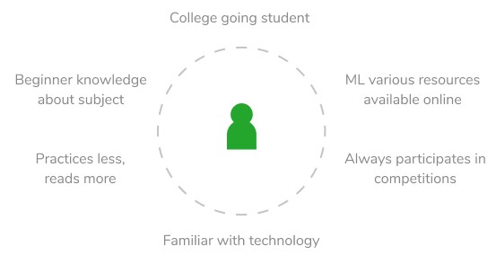
A student in college, in an age group of 18–23, looking for practicing questions and share information. He/She has joined various Facebook groups and has an account on popular platforms to practice. He/She is making time to study these courses and doesn’t want any more time waste. You know… like a regular student. :P
So to create a platform for this user, we started by trying to understand their current process.
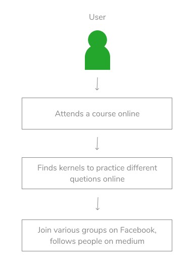
A user had to go through multiple sources to figure out about data science and practice on the international leaderboard of Kaggle and take participation in contests on AV. They also join multiple groups on FB to take guidance on ML and data science.
After understanding the current process, the problems for a beginner in this process is —
- Not a common platform to post, save and look at shared blogs/links etc.
- Local leaderboard for college based competitions.
- Practice questions of different levels.
- No team to contact or support directly.
So, to overcome we decided to build free of cost competitions holding website and a local leaderboard to understand their ranking in the college level for placements and share a common community for exchange of information. The user’s requirements include a leaderboard, competition website, share information on a common platform of college which is maintained by DSG IIT Roorkee.
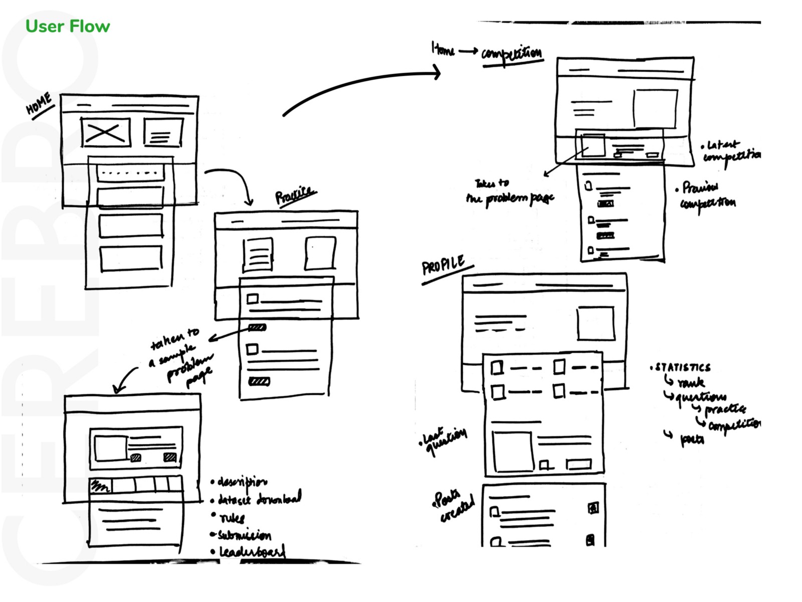
Information Architecture/ Wireframes
Then after this, we started looking at why people are so much inclined towards kaggle.com for their competitions. Turns out that people were not only interested in the level of questions there or the number of genius solutions. They have a very simple style of competition website. They have various badges for different profiles. They have a really cool design.
We decided to make the same structure for this website keeping this thing in mind that if students come to this website, they should feel familiar to the process and do not find any problem in understanding. It’s like if you buy a new bike and if the handle buttons are changed then you will find it difficult to understand and you will have a bad experience. Although, you won’t give up on your bike, of course. :P
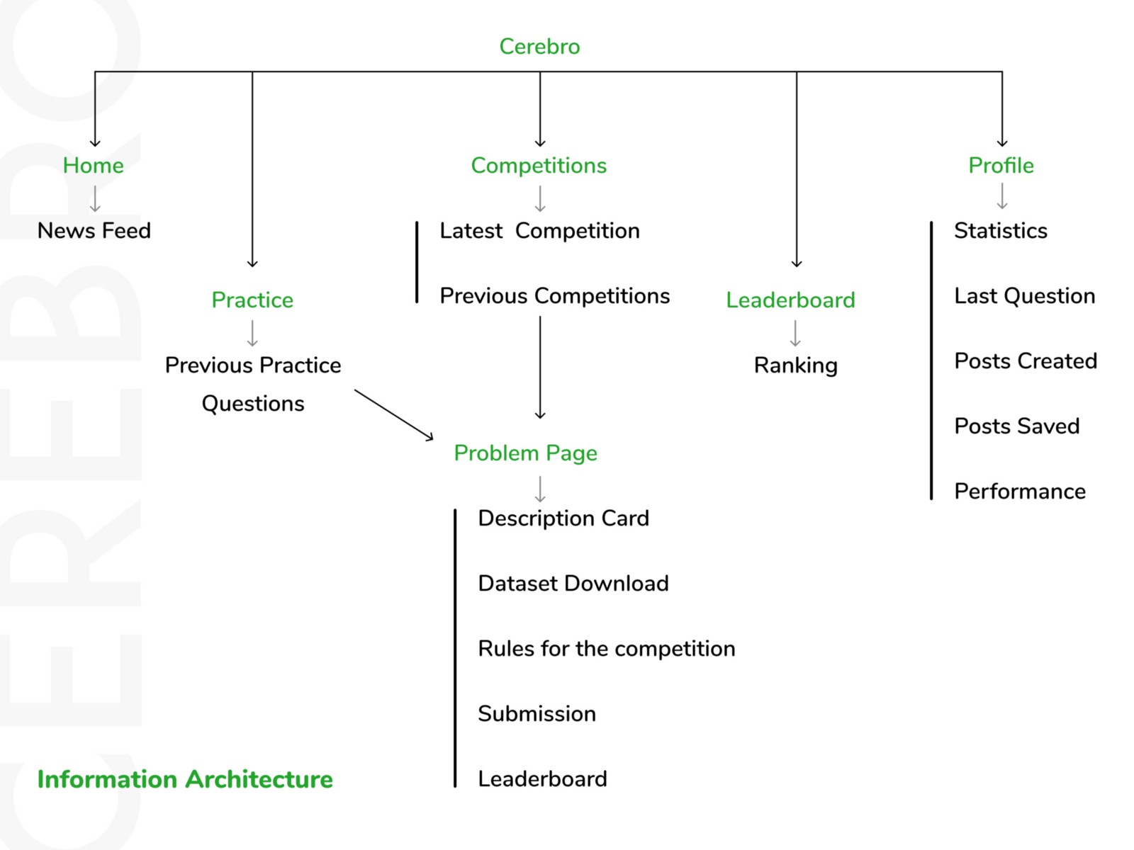
The header consisted the of Home, Practice, Competitions, Leader-board and a Profile photo (consisting of profile section and logout option).
The website was divided in the header into different sections focusing on major questions like these —
-
How to make sharing links/blogs/articles easy?
-
How to help in practice questions and promote it for beginners?
-
How to keep competitions very distinct and not mix with the practice?
-
Should leader-board be a distinct section in the header?
-
Is profile section important and if it is then what are the main reasons why people will use it?
Answering these questions helped to decide what, why, where the different sections should be kept and how much importance each hold?
-
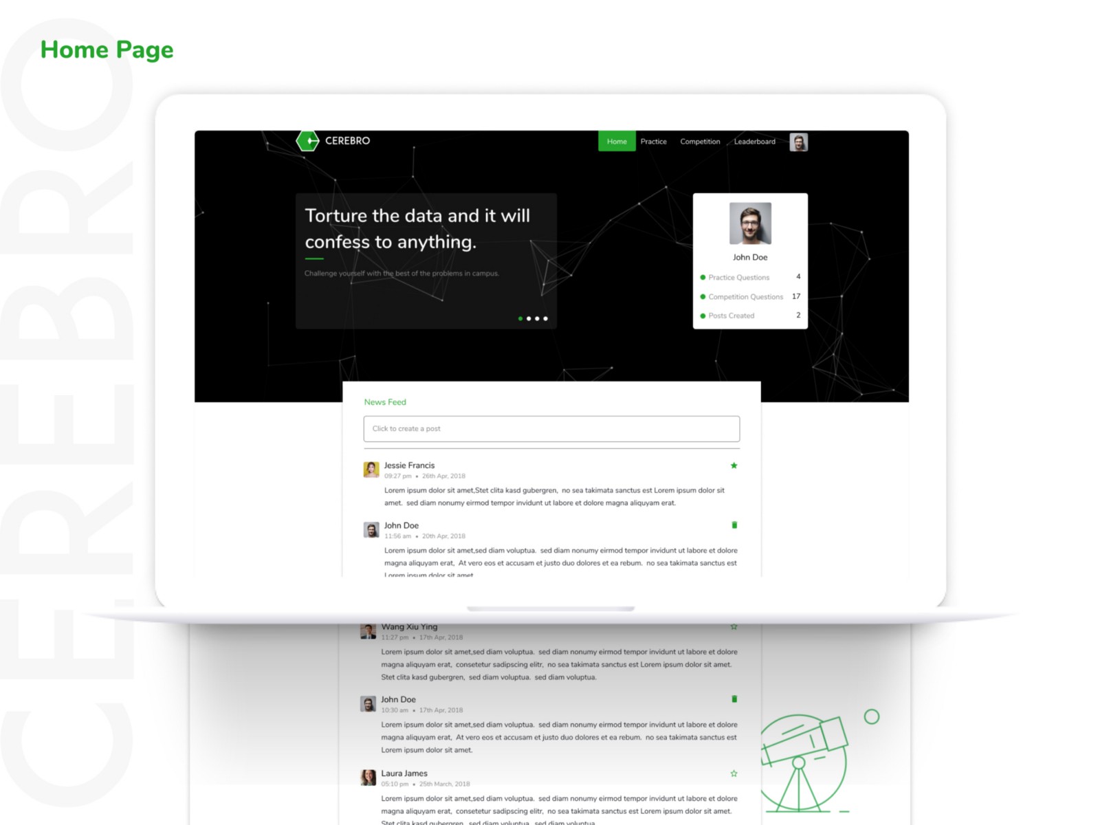
Sharing links/blogs/articles were kept at the home as it was all about focusing on the beginner students to help with various content on ML. So a News Feed section was created at the home from where people can post their material. Users can also save the post they like and delete their post directly from the screen.
-
Practice and Competitions were kept as different sections to make a pseudo boundary and keep it easy for the users.
-
To share various information there was a slider on the main page. The slider consists of information about new competitions or any kind of notice which is to be told to students.
-
The importance of the Profile section will be just to reach out to the saved posts, update details etc. But most importantly users might like to look at their small details like the number of questions they did, posts they created etc. For this, we decided to keep a small card in each section at the top consisting of these details.
Front-end Development
Languages used include HTML/CSS and Javascript. It was in MVC architecture. As the site is dynamic, the front-end was done on using the powerful virtual DOM of ReactJs library.
Features
-
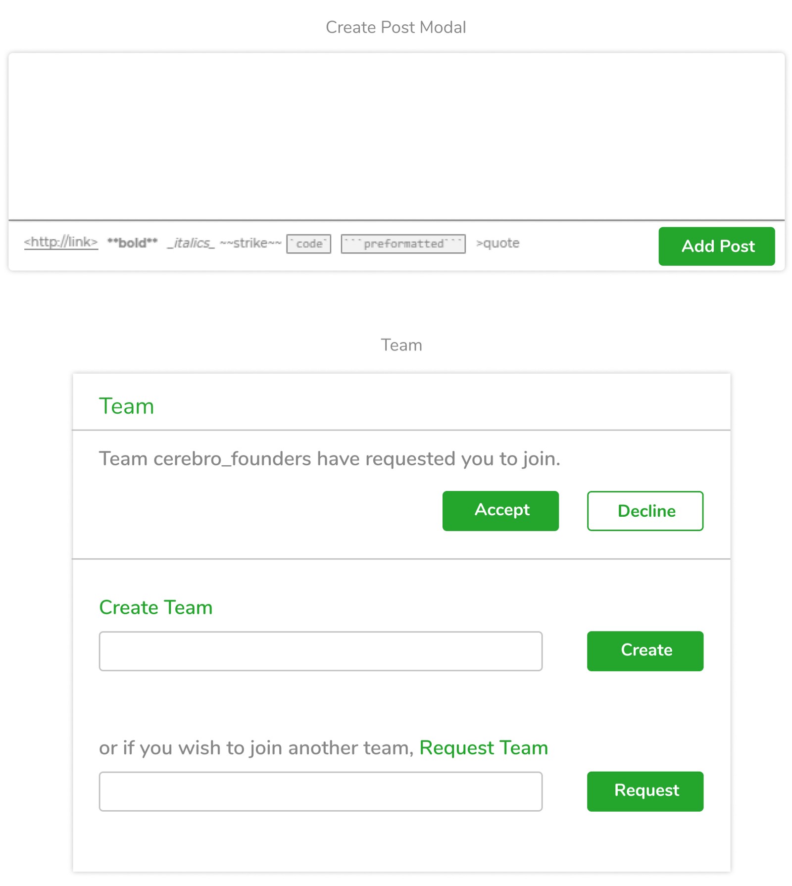
Posting links, blogs and any other material with a ‘Post’ section which contains markdown options. Reason being that most links are shared or code is shared which can be introduced easily in a markdown format.
-
Adding team to complete a project. As some of the competitions require a team to participate. Team request, invites can be sent.
-
Some of the posts which a user likes can be saved and be looked later in the profile section by clicking on the ‘star’ button. Similarly, posts created by one can also be deleted.
-
The user can add his personal details to introduce himself in a better way by mentioning his/her social links and writing a bio.
-
Banner is added on the landing page to introduce or promote any sort of competition or notice through a carousel format.
Design
Homepage
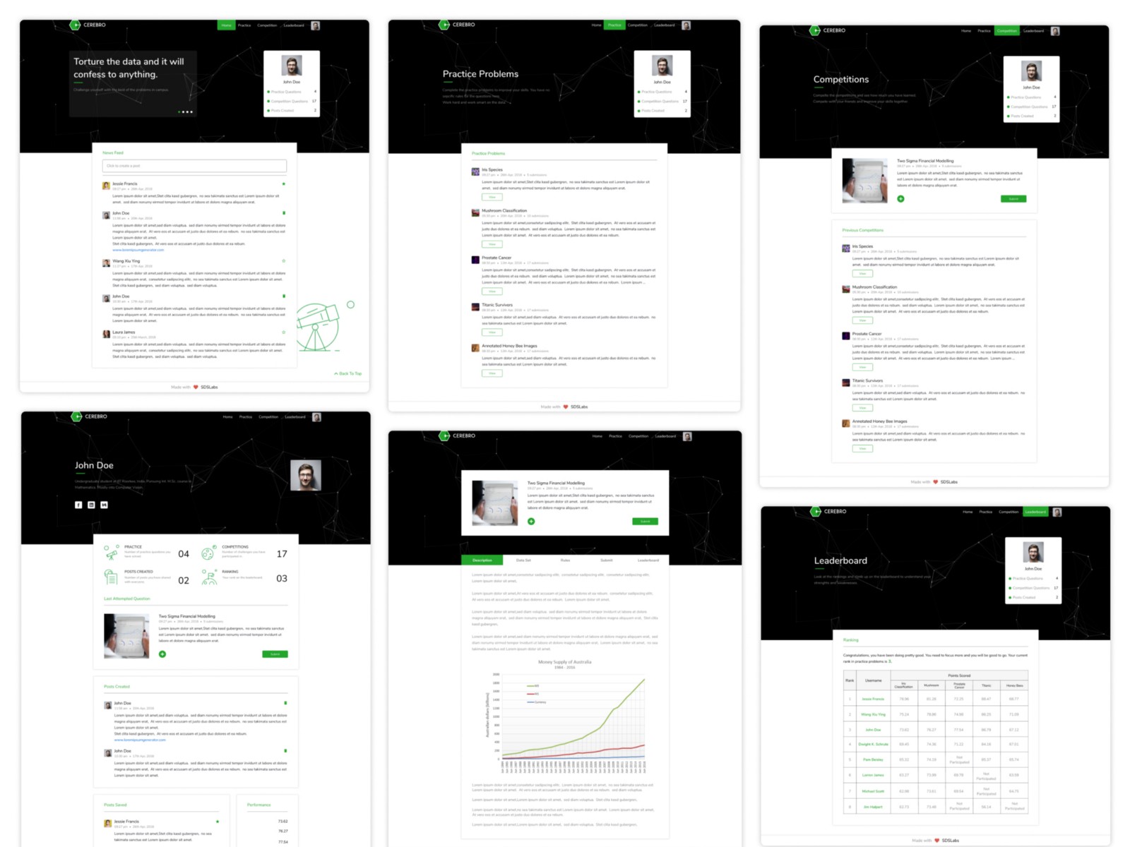
As the homepage consists of the main feature of posting stuff, saving them and deleting them. It also contains carousel which contains information and news feed which contains information from other users.
Practice
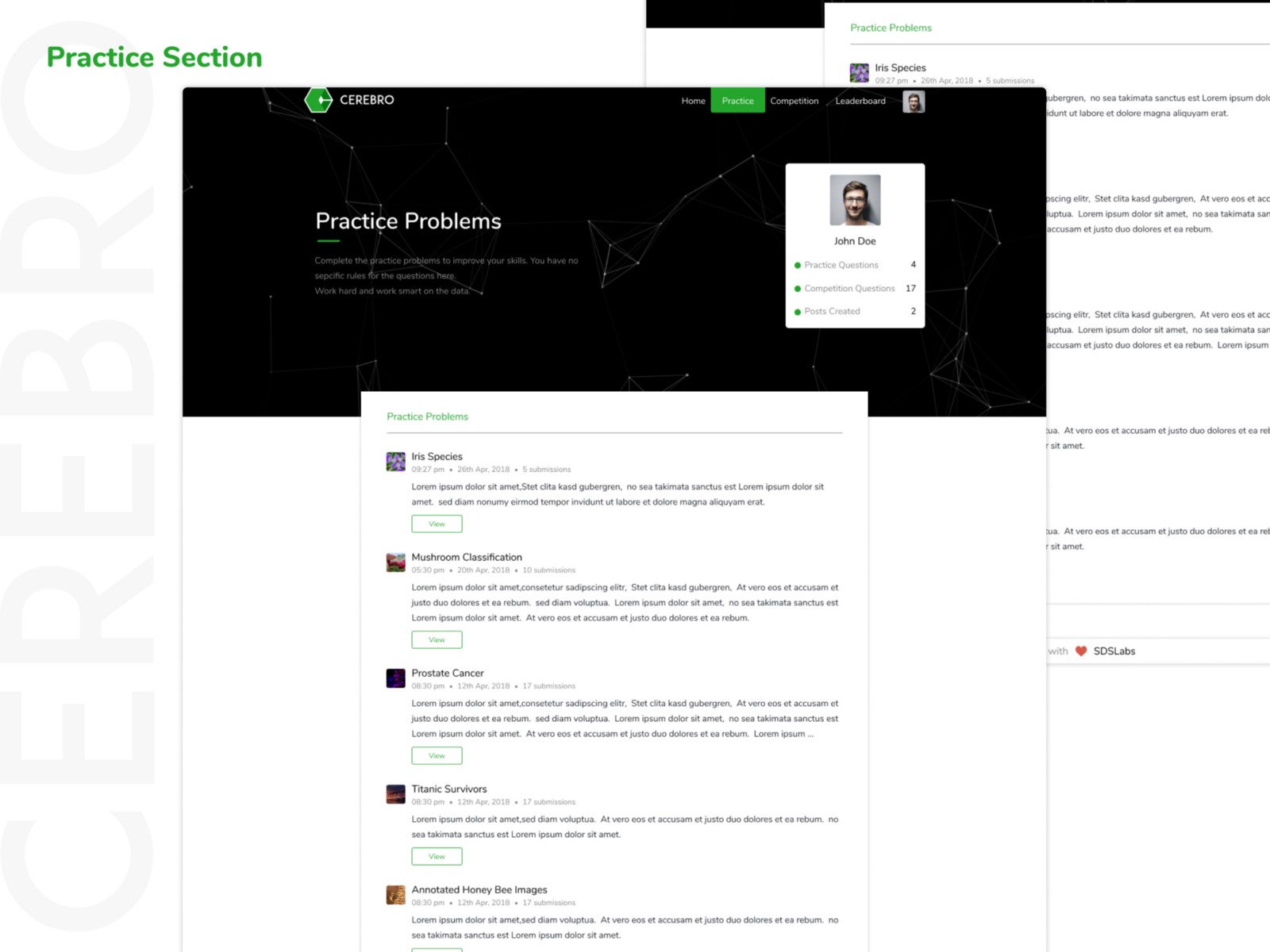
The practice section consists of a list of problems with a direct button to their individual problem page.
Problem Page
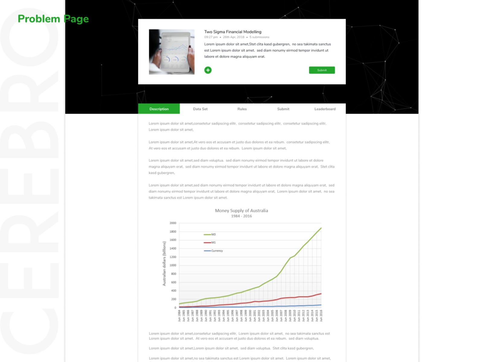
Problem page consists of 4 sections in case of practice and 5 sections in case of competition problem. These sections are-
- Description
- Data Set
- Rules
- Submit
- Leaderboard
Competitions
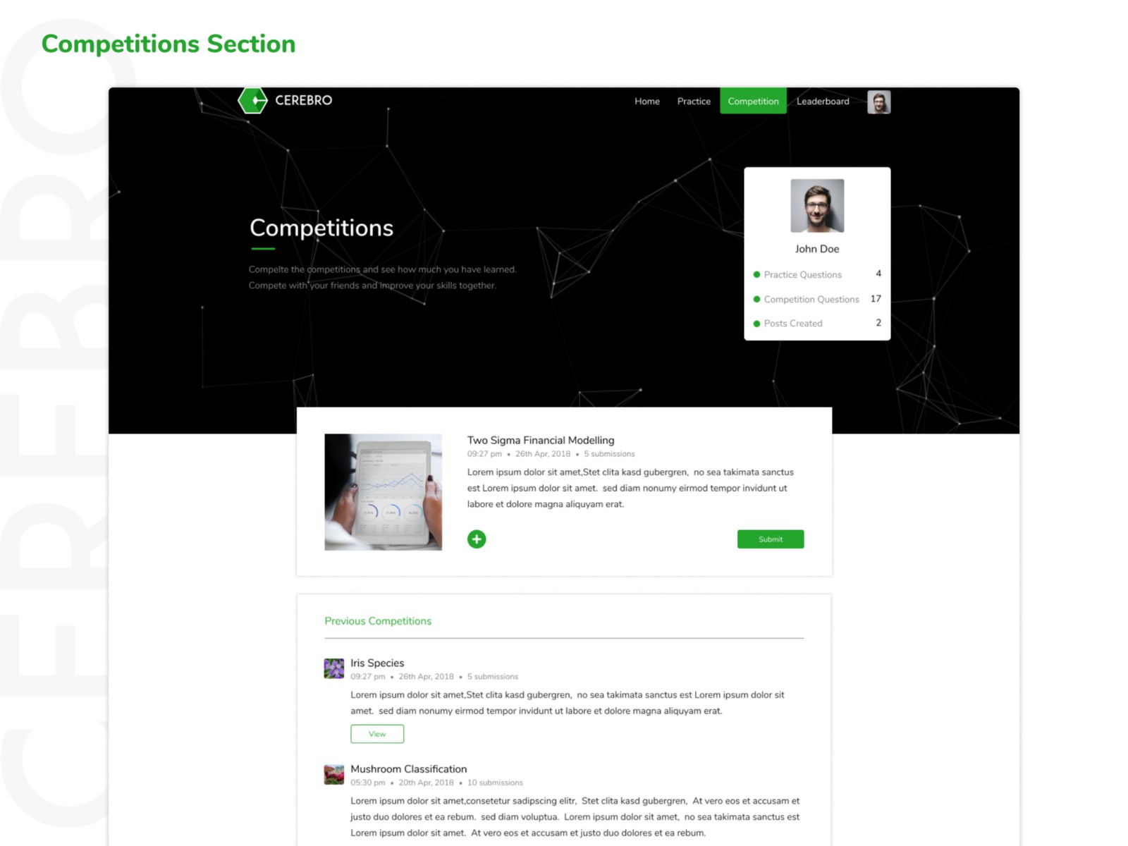
The competition section contains one card specifically for the latest competitions. So to emphasize it, the card is placed centrally above all the other competition questions. The ‘+’ button is to add the team. When clicked it opens up a team create and join modal as shown earlier.
Leaderboard
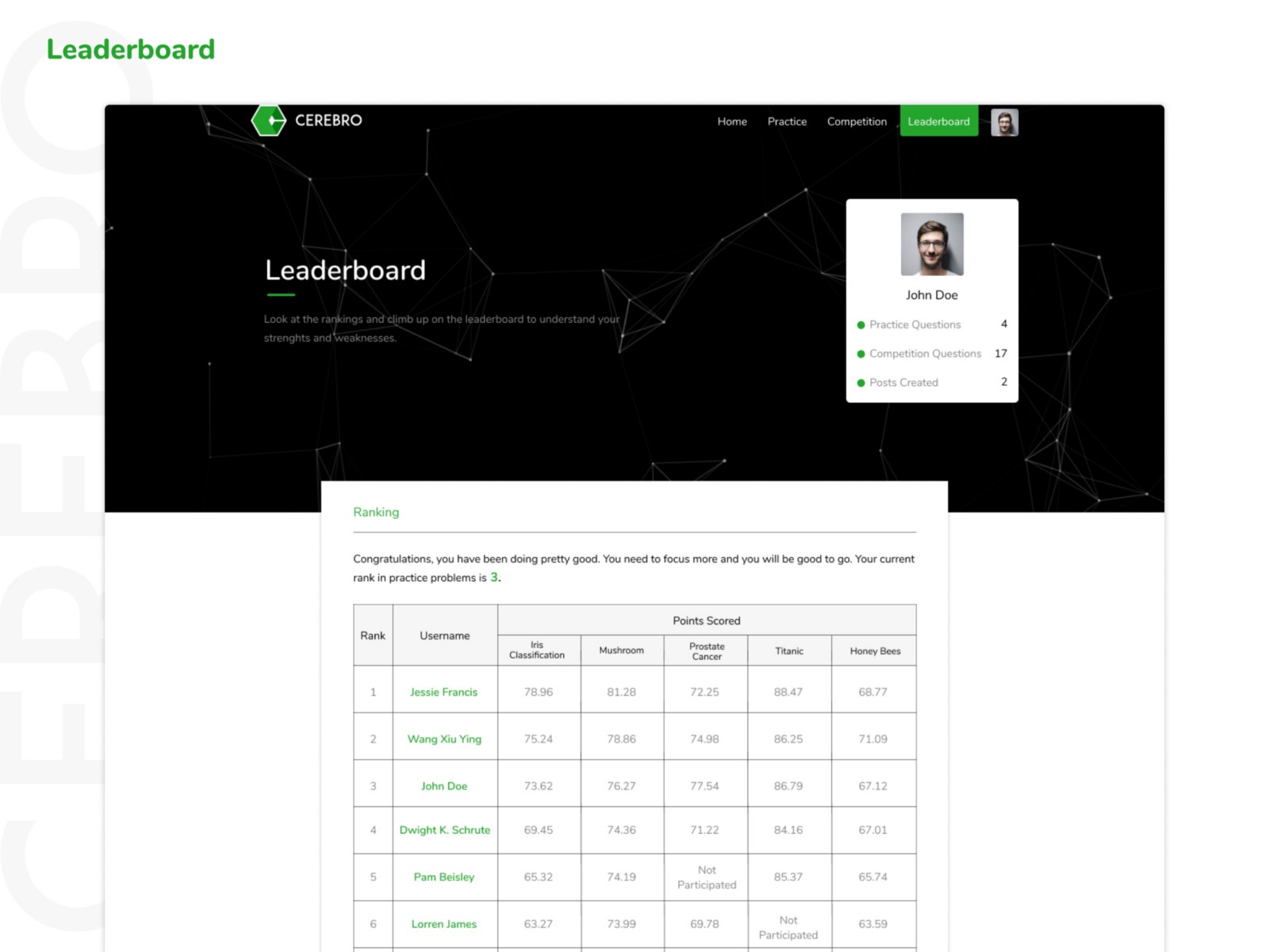
This section consists of the overall rank and the points scored of the latest 5 questions so that the key users who are in good positions are always aware of the new questions.
Profile
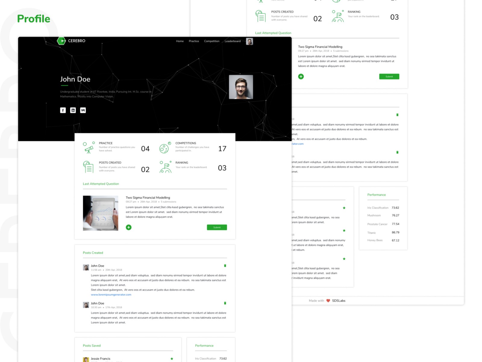
The profile section contains lots of information about the user where he/she can upload his/her social links and also check other details like ranking, saved posts, individual problem score.
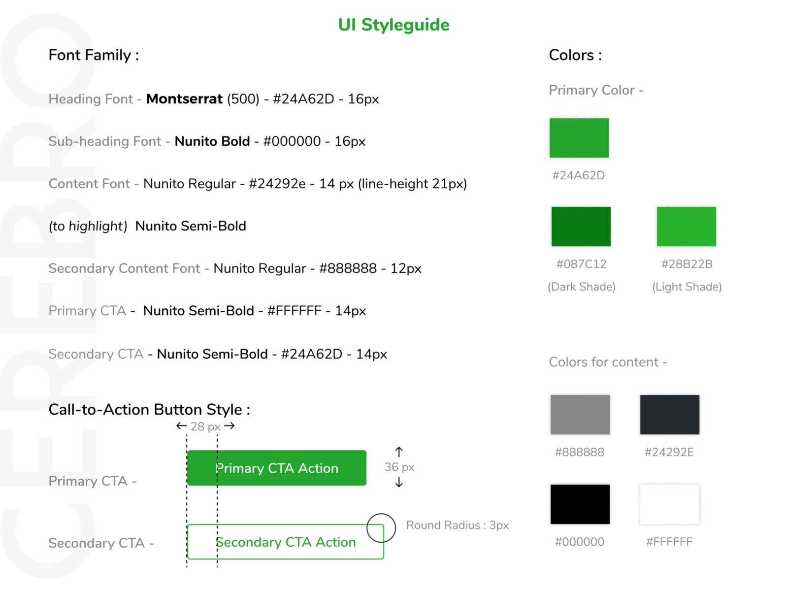
UI style guide
Illustrations
Logo making is the best part in designing. It allows you to take up random ideas and convert it into something so simple that it makes sense. For us, its more like trying to explain something in a very simple manner or explaining its core values. For Cerebro, we tried to explain the basic working of machine learning and what it means in one line. We converted that idea into a logo.
The logo presented has a very crude meaning about what is Machine Learning. Machine Learning for a rookie is defined as a black box technique. It helps to generate a conclusion regarding a problem either by solving classification problems or regression problems. Here, this logo is a fusion between the two ideas of Black-Box and a result from it.

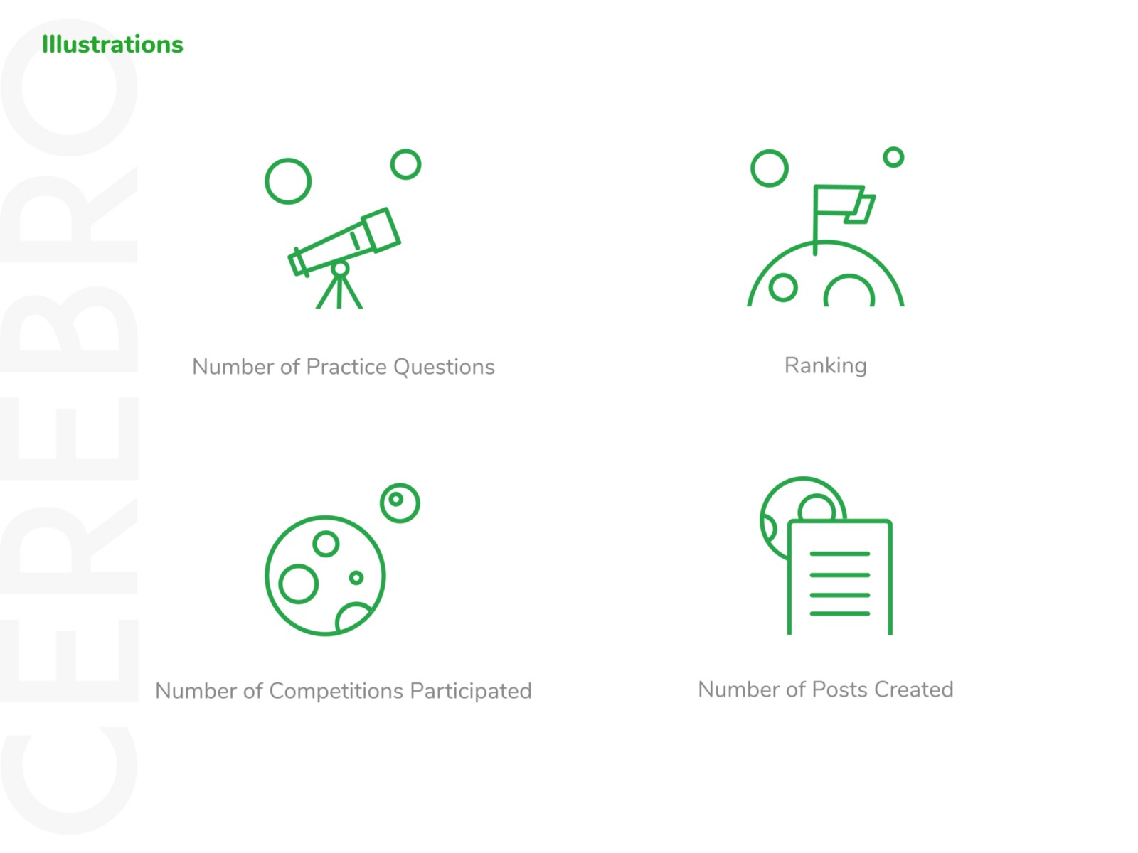
Several other illustrations made for the same website
What’s next
With the launch of Cerebro towards the end of October, we have already held a week-long competition ‘Melodious Medley’ which saw more than 200 submissions and 100% uptime. We also have two more competitions in the pipeline this semester based on Computer Vision and Natural Language Processing. With initial goals being reached, we look for what’s next. Recommendation System? Way to early for that! New metrics and data visualizations? That sounds much cooler. So stay tuned for v1.1 :)
