To Organise is to Design
What is Syntax Error
We at SDSLabs (Software Development Section Laboratories), a student-run technical group of IIT Roorkee, constantly try to promote innovation and foster technical activities in the campus.
Syntax Error is one step towards this. It’s a campus level hackathon where students come up in teams and work together to build some amazing applications from scratch. It’s 60-hours all about coding, coffee, designing, brainstorming, snacks and finally presenting the output.
The main aim of this event is to indulge the freshers and tech enthusiasts of the campus to work together and learn from each other.
Organising the event
As the organisers of this hackathon, our focus was to get more and more enthusiastic people to participate. In the course of the event, we had to ensure the following things were performed smoothly:
- Promoting the event on the campus to generate more and more awareness among the people.
- Conveying general information regarding the hackathon like prizes to be won, who can participate, how to form teams, etc.
- Providing a platform to register in teams.
- Conducting the hackathon and keeping the participants charged up by a dose of snacks, coffee and most importantly guiding them as they work.
- Announcing the results and giving away prizes.
The Design Part
In the previous versions of Syntax Error, held in the past years, Facebook posts were used to promote and convey the information. For registration, an online form was used. Everything went according to the plans but there was something that we missed. Each step was existing good on its own, but what we lacked was a unified approach.
This time, we were planning to go bigger by including sponsored prizes as well. This was the right time where we could create a visual language to carry everything together. What we needed was promoting Syntax Error using a brand identity.
Branding
Branding is the art and science of defining and differentiating yourself to the public. A brand identity is not just about pretty design elements. The more important thing is conveying the values associated with it.
Branding is what sticks in your mind associated with a product, service, or organisation.
It was important to know what we were trying to convey through this brand identity. The values chosen would be helpful to stick the brand components along a direction.
- Spark of creativity
- Enthusiasm
- Promoting teamwork
- Learning by doing
The branding included the following components, together building up a system which was aligned with the values chosen.
Colors
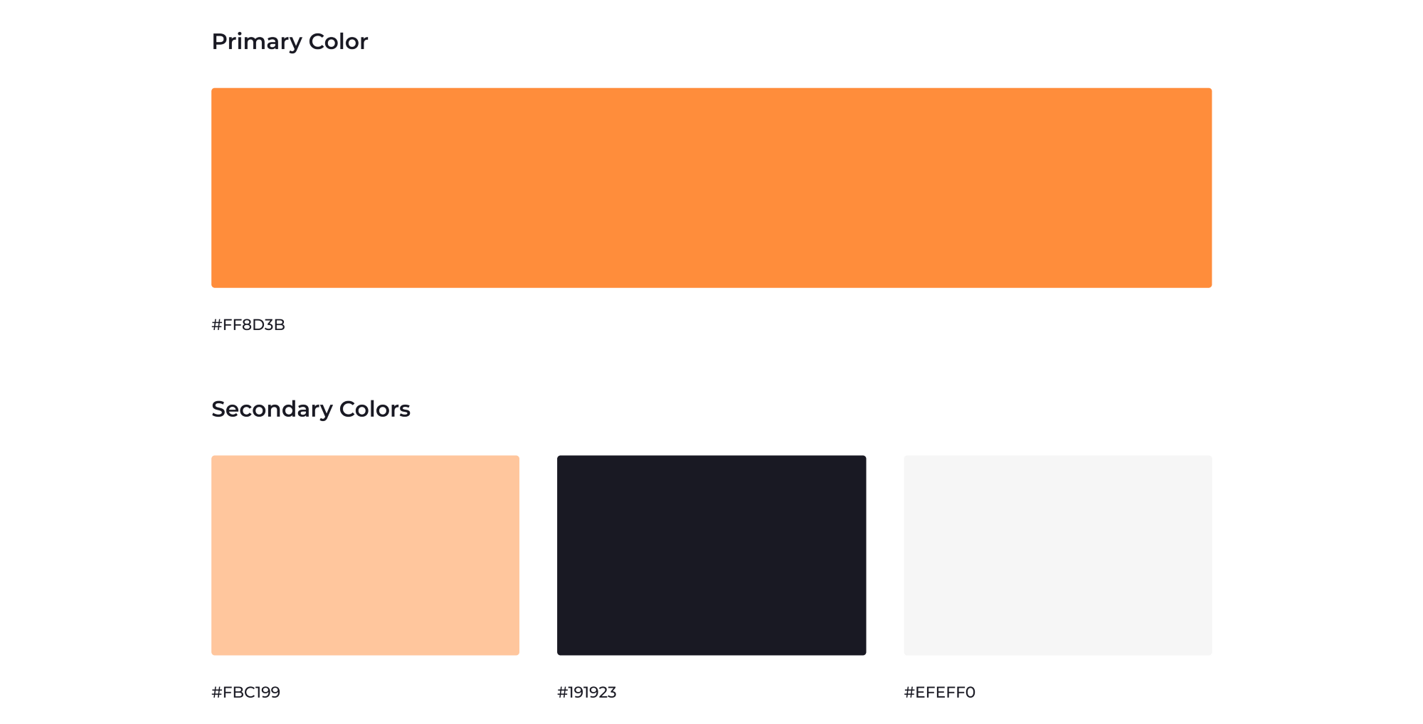
Orange was chosen as the primary color as it best represents creativity and enthusiasm. It was toned more towards the yellow shade as it gives a sense of togetherness or teamwork.
Logo
Brand is like a human being and logo is like the uniform it wears!
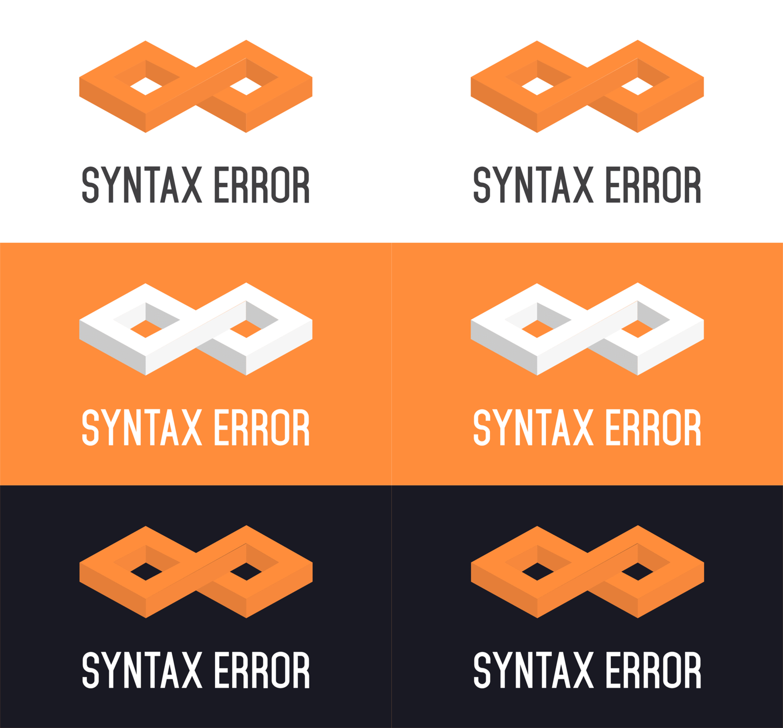
The logo is the most important part of a brand identity. It is like a face to the system we are building.
We derived the basic concept of the logo from the previous version and molded it according to our brand identity.
Typography
To impose a creative feel rather than a formal one, Montserrat was used as the major font throughout the brand elements. It creates a majestic yet fun look and evokes a modernist style.

Illustrations
The illustration style consisted of simple shaped elements with an emphasis on the brand colors. Stroked outlines and spilled fill colors convey innovative thinking and experimental approach to doing.

Posters, Invitations, Certificates
Promotion posters on social media, certificates for winners and invitations for professors and judges were designed such that they all formed a relationship that they belonged to Syntax Error.

The Landing Page
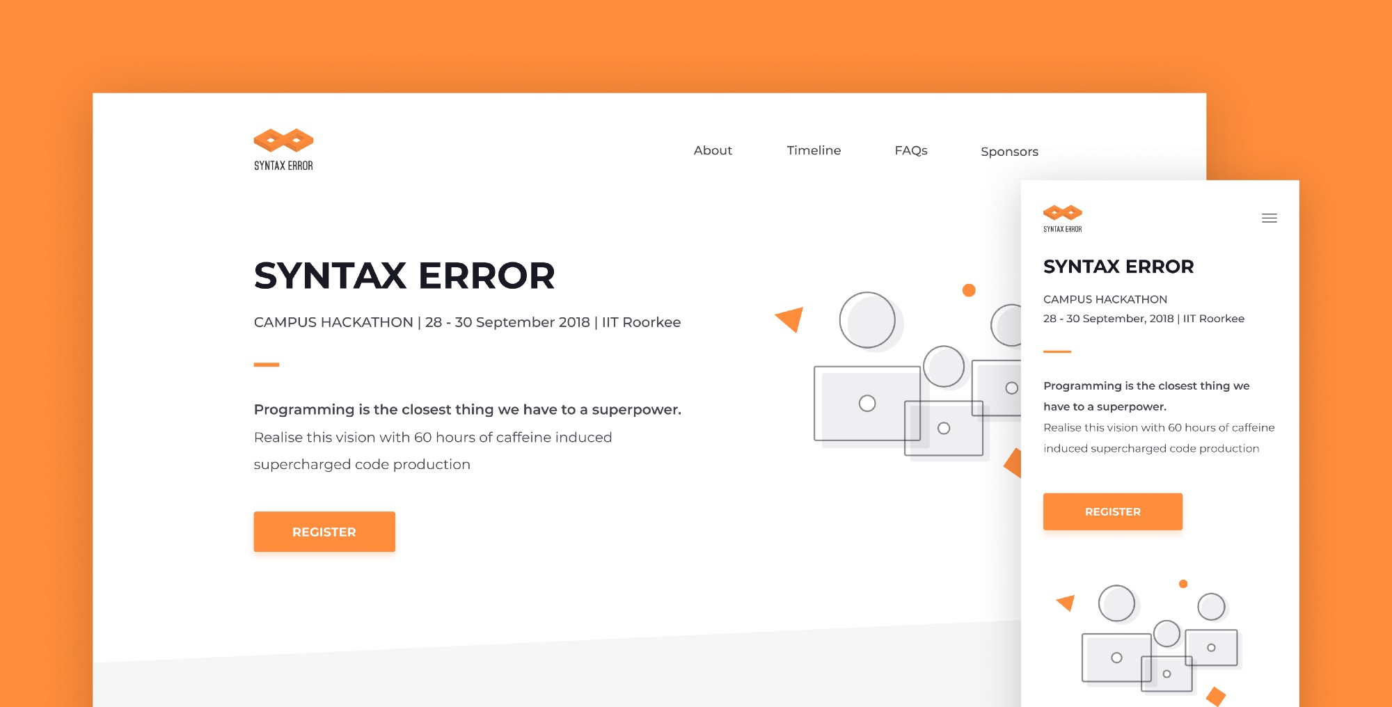
We followed an approach of connecting the landing page to the promotion campaign. We ensured that everything on the page conveyed the same message and gave the same feel as defined by our brand values. In doing so, users feel comfortable that they have reached the right place.
The conversion goal of the landing page was to make people register for the hackathon while also conveying the must-know and nice-to-know information regarding the event.
![[Landing]](/images/posts/syntax-error-2018/landing.gif)
Source: Dribble
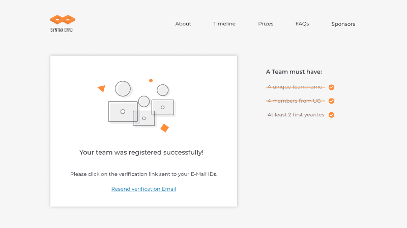
Upon clicking the CTA, the user is directed to fill the form of registration.
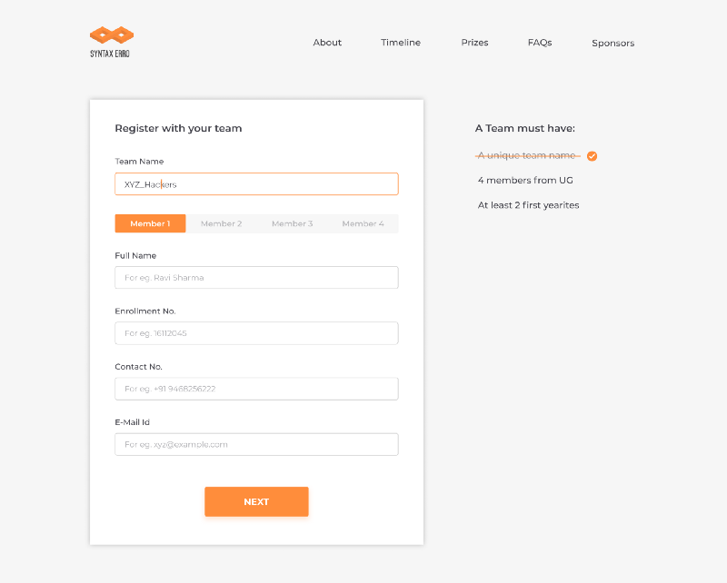
A confirmation mail is sent after she finishes the registration.
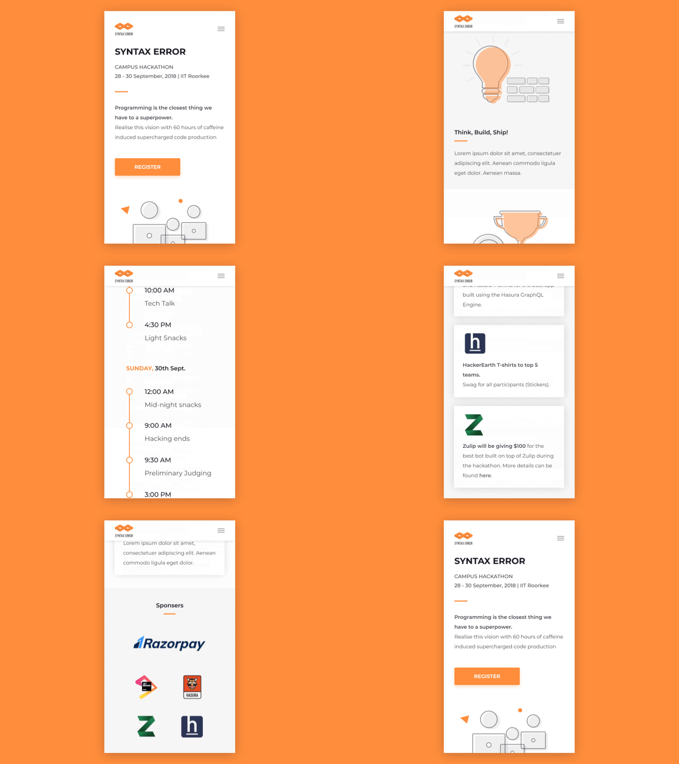
The website was made responsive to work nicely on mobile devices as a majority of users would be using a mobile phone to visit the page.
How it went
The hackathon saw huge participation of students with over 100 teams registering. People worked on several technologies like machine learning, game development, information security etc. and built some amazing applications in the 60-hour sprint. We saw a great involvement of freshers who were enthusiastic and willing to learn.
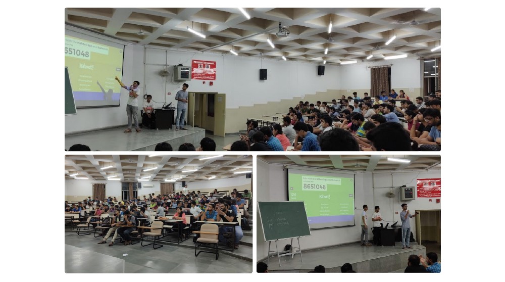
Altogether, the hackathon was a great success. Receiving prizes was surely a great motivation for the winners and for others, they took an awesome learning experience with them.
