Designing a practice-session platform for Hackers — UX/UI Case Study

The following is a UX/UI Design Case Study describing how I designed a platform(PlayCTF) for the CTF players to help them focus on what they love doing- “Hunting down flags.”
Have you ever wondered how Cybersecurity experts and bounty hunters sharpen their axe? Yes, they participate in CTFs to do so.
PlayCTF is an open-source platform that can be used by anyone to host an individual Jeopardy-style CTF at a time, Currently under development at SDSLabs (A student-run campus group under Software Development Section, IIT Roorkee.)
But before we begin, let me get you some context.
What is a CTF?
CTF(Capture the flag) is simply a cyber-security game, and it consists of mini-challenges whose security the players need to break in order to get some secret strings(flags), which lead them to victory. This specific kind of CTF is called Jeopardy-style CTF.


A typical flag might look something like this.
My Role in the Team
We worked as a team of 1 UX/UI Designer(me) and 3 Developers.
Luckily the developers I worked with were all regular CTF Players and were always up for a chat.
My role was to understand the requirements of the user(CTF Player) and to provide the best possible experience to the user while taking into account our technical abilities and constraints. Key deliverables being High-Fidelity wireframes.
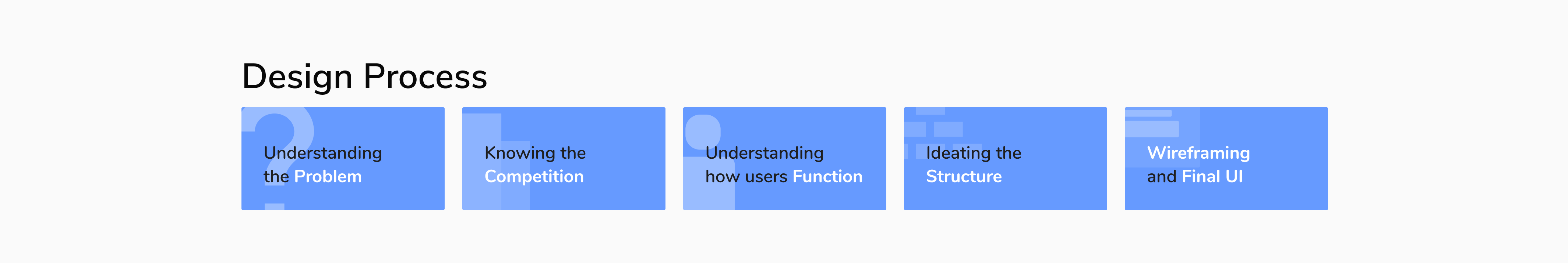
Understanding the Problem
Some organizations like cyber-security groups and recruiters need to organize tests/practice-sessions, but do not have a platform on which they could deploy their challenges. They either deploy these challenges on self-built quick and dirty websites or end-up paying giants like cftd.io or ctftime.org in order to organize these CTFs. How might we help them get this tedious work done without asking for much effort?
Knowing the Competition
I started using some common platforms like ctfd.io, ctftime, backdoor, etc. I tried to understand these products inside out and how our solution differed from these platforms. Also, where I could provide the user with a better experience than these products.

“We decided to build an open-sourced solution that anyone could use to organize an individual Jeopardy-style CTF using their own server.”
Understanding how players function - User Flow
Some of my friends participate in CTFs quite regularly, I used to observe them solving challenges.
CTF Players are usually quite competitive in nature and they -
- Need to plan how to efficiently use their limited time.
- Want to quickly solve challenges submit the flags.
- Want to keep track of their progress and current standings.
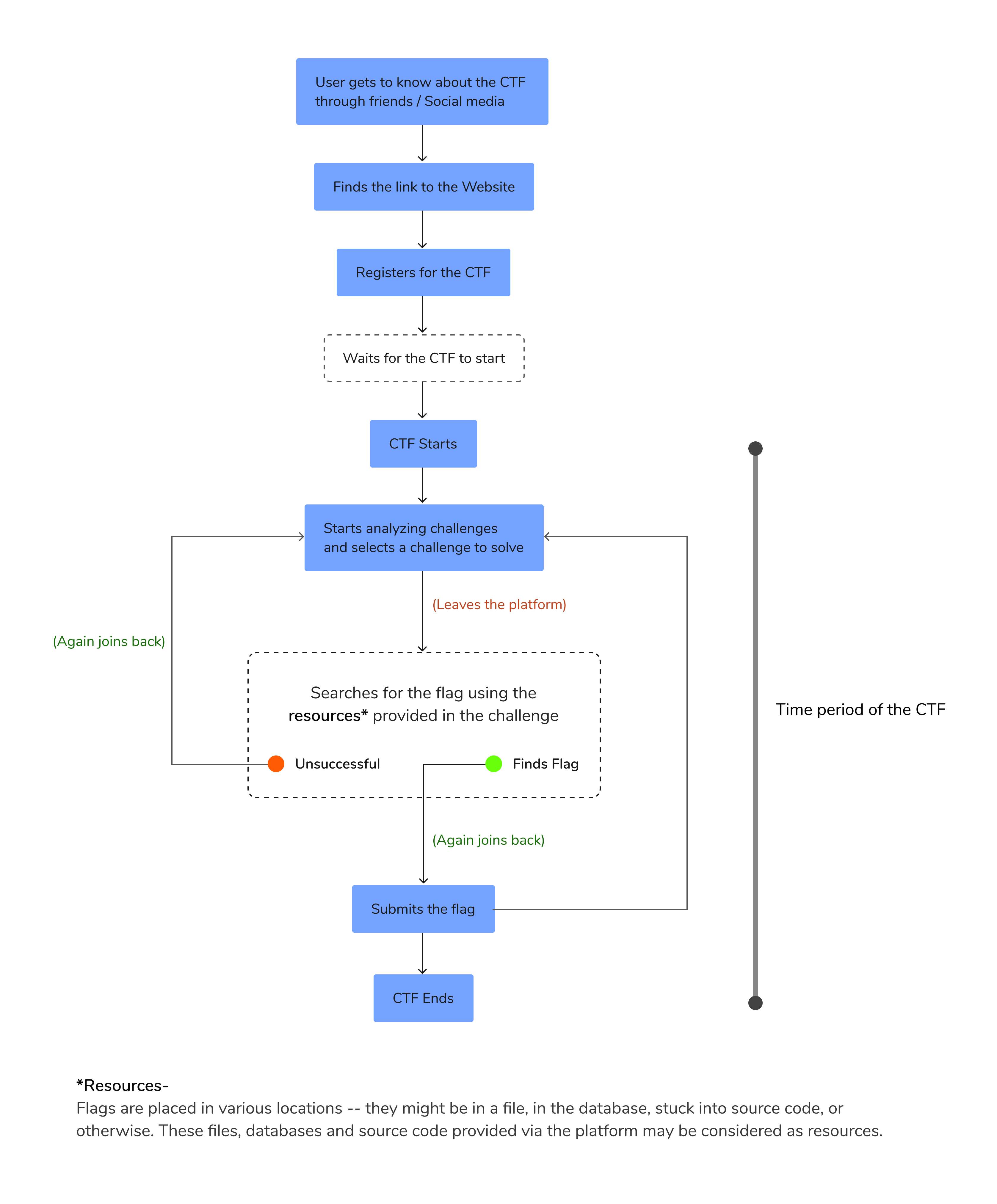
Usually, a CTF challenge requires a player to -
- Minimize the window
- Hunt the Flag
- Come back and Submit the Flag
In my opinion, this process where the user leaves the platform and again joins back needed some extra attention!
Ideating the Structure - Information Architecture
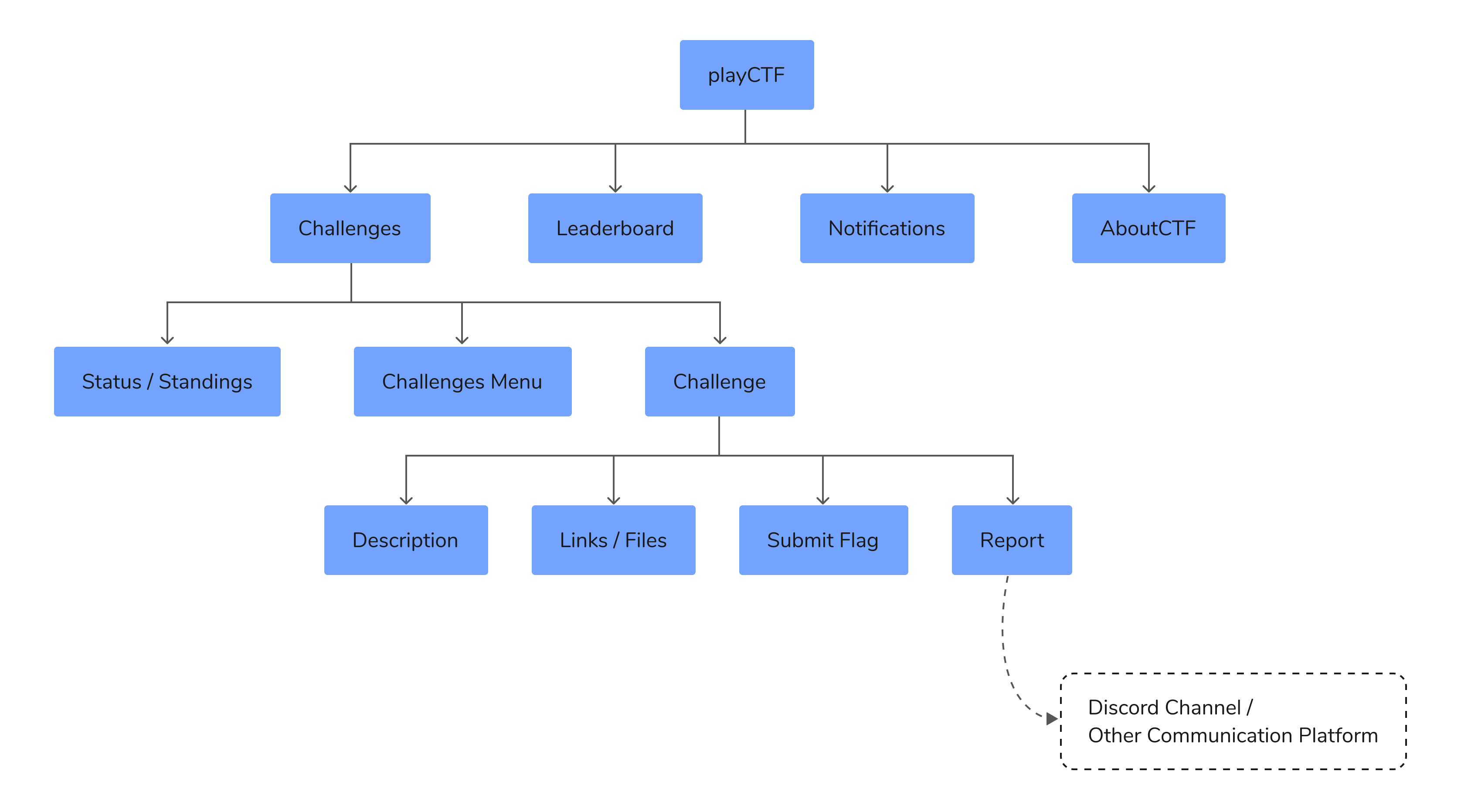
Wireframing
The heart of this product lies in the “Challenges Page,” this is where a CTF player would spend the maximum amount of time, switching between challenges, strategizing how to use his/her precious time and solving those challenges, and submitting the flags he/she acquired.
Throughout the wireframing, I focused on how to make this process easy and fast for the user(player). I ended up with a few iterations while taking continuous feedback from my friends who regularly played CTFs.
Iteration 1
I tried using cards for each challenge, which redirected the user to a Challenge Modal. Here the user could access all the essential info which is required to find the flag.
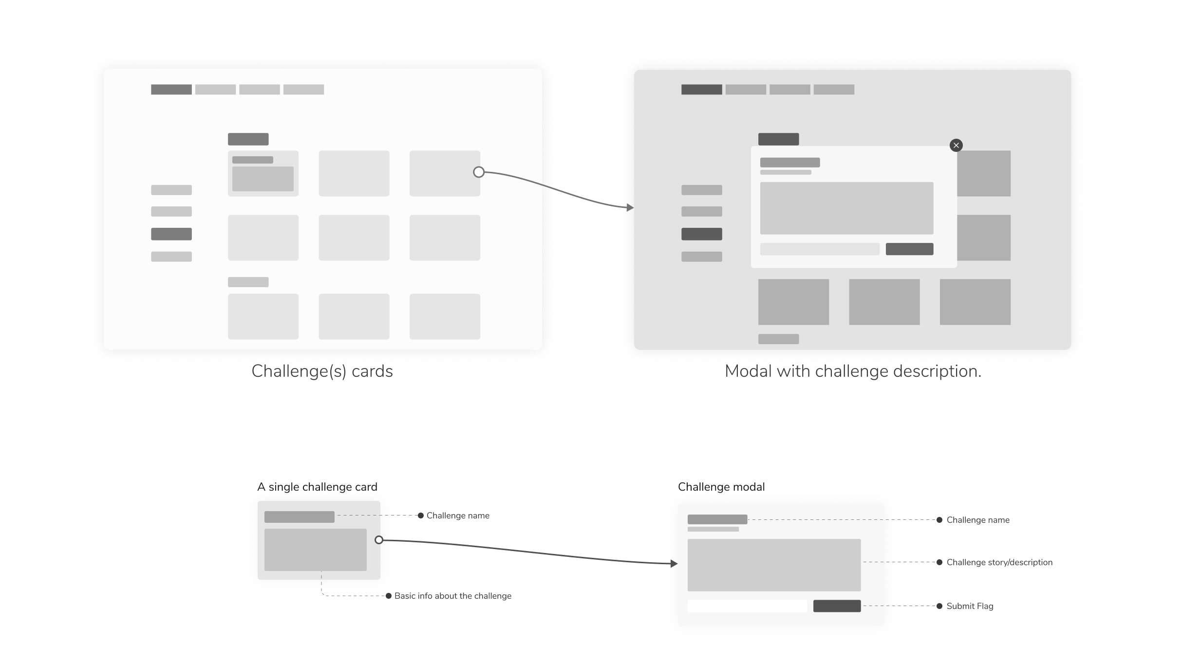
This approach seemed feasible at first because it presented the user with a large number of challenges without much scrolling.
Later I realized what mattered even more to our users was the ability to switch between various challenges and submitting flags as quickly as possible. This modal-based approach slowed it down quite a bit!
Iteration 2
I tweaked the card a bit by adding the option to submit the flag externally, even without opening the challenge description. Also, I provided the option to switch between modals(challenges) using keys or clicks. Maybe it didn’t remain a modal anymore.
Still, it did not seem to solve the purpose. (Speed) This was mostly due to the use of the “MODALS.” I decided not to use them for the next iteration!
Iteration 3 (Final Iteration!)
The final version, which I decided to settle with was a trade-off, it showed fewer challenges to the user(player) but significantly increased the ease and agility with which the user could now switch between challenges and submit flags.
It was somewhat a blend of the first two iterations I managed to come across.
Final UI
Now I’m presenting the final designs. SDSLabs design guidelines were followed while designing these screens. drumrolls
Although this was the default color scheme we chose to provide, but the color palette can always be changed by the admin to suit his/her needs like the ones shown below. (Open-Source perks)
One of my friends suggested me to try this color palette. (for fun)
Conclusion
This was my very first design project and I learned a lot of things along the way-
- I had never worked on a product from scratch.
- I didn’t know what was a style guide and how it could be used to achieve consistency.
- I had to make illustrations. I learned a bit of Graphic design!
- I had to collaborate with developers, make them understand what was inside my head.
- And most importantly I understood how the iterative process worked when followed along with feedback.
Moreover, it taught me how to work well with people around me, to manage collective efforts, to meet deadlines, to not fall in love with my work, and to seek feedback open-heartedly.
Thanks for reading. ❤
Want to create something? I’ll be happy to help! Reach me at - [email protected]